
Credit
Karl Nielsen
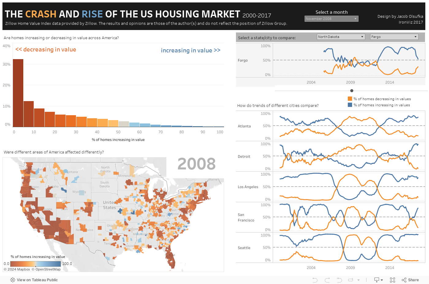
Check out this very cool Tableau visualization from Jacob Olsufka at Decisive Data: The Crash and Rise of the US Housing Market, 2000-2017. It looks at a large number of cities across the United States and breaks down in chart, map, and graph form whether homes prices were increasing or decreasing in a given month and year between 2000 and 2017. It gives a good sense of just how widespread and long-lasting the carnage was during the Great Recession, and by contrast how healthy the overall housing market was (with a few notable exceptions) as of the latest available data in August 2017.
The visualization is excerpted below but should ideally be viewed full-screen to do it full justice.


Submit your comment
In order to receive a reply to your comment, please provide an email address.